
This toolkit originates from the Health Sciences Information Consortium and is in the process of being adapted and updated by the CHLA/ABSC Standards Standing Committee.
Visualizations are a way of representing information or data in a visually appealing form. They can help distill and simplify complex data or concepts, and are a lot of fun! Visualizations like infographics have become increasingly popular with new open-source tools and social media.
Although visualizations can facilitate understanding many levels of data and information in just a few images, they can also be overused or misused. It is easy to ‘skew’ the story with an infographic. “Figures don’t lie, but liars can figure” – though the chart or graph may be ‘technically’ true, the author can easily have manipulated it by withholding the whole story contained within the larger data set. It’s therefore very important to still cite or reference the various parts of an infographic.
When creating a visualization, keep in mind and incorporate the three basics of communication: appeal, comprehension, and retention. Brush up on design rules, and frequently solicit and incorporate feedback. A poorly designed or executed visualization can be worse for your image than not doing one at all. Finally, cite your sources; keep your data credible by providing the background story to underpin your distilled format.
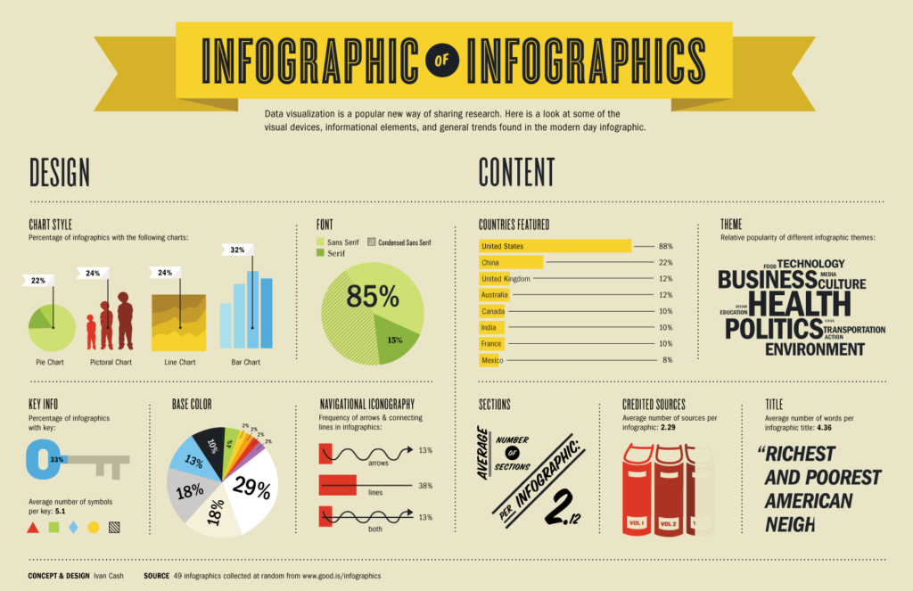
Example
Resources
- Infographic Design: Complete Guide for Non-Designers
- Canva: Online Infographic Creator
- Easel.ly: Online Infographic Creator
- Gliffy: Online Diagram & Flowchart Creator
- iCharts: Online Chart Creator
- Tableau Public
- Excel for data visualization in academic health sciences libraries: a qualitative case study
- Visualisations en bibliothèques: comment rendre visible l’invisible